Changelog

Follow new updates and improvements to contentmaker.

Watch and download your Frame.io videos right from your dashboard

This is an exciting one! Until now, a deliverable linked to Frame.io was really just a link: to see the cut, you opened Frame.io in a new tab. Not anymore. The video now lives in the dashboard itself. You see it on the card, play it on the board, and download the original, all without opening Frame.io.

See every cut on the board

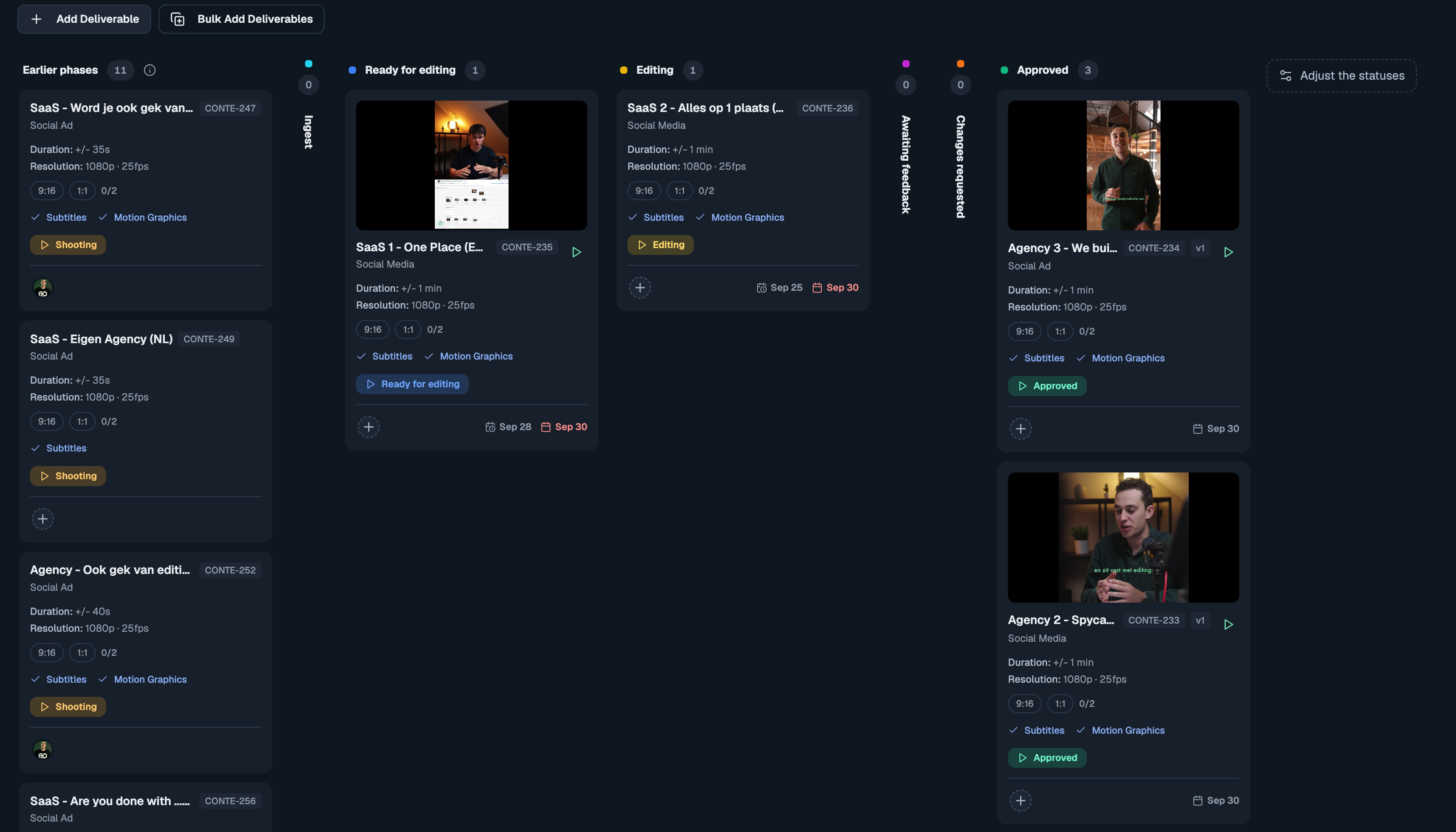
Every deliverable with a Frame.io video now shows its preview frame on the card, so you can tell which cut is which at a glance. Click the frame and the cut plays right there on the board. Step to the next or previous cut without closing the player. When a new version comes in, the frame updates on its own. Prefer a compact board? Hide the previews under the board's Fields menu.
Watch and download from the Video tab

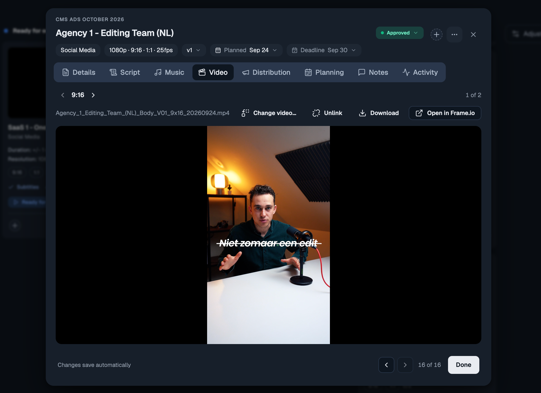
Open a deliverable and its Video tab plays the cut in the panel. The Download button fetches the editor's original upload straight from Frame.io, under its own file name. That works for files a browser can't play too, like a ProRes master.

Comments and approvals still happen in Frame.io, one click away, and your clients keep getting their review link as before.
One video for each output

When a deliverable has several outputs (a 9:16 and a 1:1, or Hook A, Hook B and Body), each one now has its own video. The Video tab steps between them, and each output plays, downloads and links on its own. New uploads find the right output from the ratio or hook in the file name. If a cut lands on the wrong one, move it over with one click.

Linking to Frame.io is easier

  • A deliverable without a video lists the project's Frame.io files, the likeliest match first, so linking is one click. Change video… fixes a wrong link.

  • The Link… picker shows each video's preview frame next to its file name. A stacked video shows its newest version.

  • When the same file name shows up again, newer, elsewhere in the folder, the older copy is marked superseded and listed below the current cut. Automatic linking no longer picks it up.

  • If Contentmaker edits for you: Share with Contentmaker now creates the project's Frame.io folder for you, next to its Dropbox folder, laid out as end client, then the project with its date. That also works when you share a project that already existed. A quote gets its folders once you accept it.

Also new

  • A Frame.io upload or comment that failed to process is now retried instead of lost, so the video still gets linked and the comment still moves the card.

  • Empty board columns fold to a narrow strip, so the busy columns sit closer together. You can still drop a card on the strip.


Want the day-by-day? Every release lands inside the app under What's new. Open the ? help menu at the bottom of the sidebar. This changelog collects the highlights; that page has the lot.

Got an idea, or found something broken? Give feedback, in the same menu, opens the feedback board. Post a feature request or a bug report, and upvote what other people have asked for. The most-wanted requests are what we pick up next, and you can follow the whole Roadmap from there too.

Improved

The planner works with your Google Calendar now & more

Two weeks with the new planner, and a lot of your feedback in one update. The biggest change: your Google Calendar is no longer just something you look at in the planner. You can open an event, join the meeting, move it, and turn it into a timesheet entry, all without leaving the page.

Your Google Calendar, now clickable

Click any Google event on the planner and it opens on the right. A meeting shows a Join button for the call, the guests and whether they're coming, and a link to open it in Google Calendar. A regular event just shows what it is and when.

Move your own events, and they move in Google too

Drag one of your own Google events to another time, pull its edge to make it longer, or change the start and end in its panel. The change is saved straight to Google Calendar, without emailing anyone, and every change can be undone. Meetings where you're a guest stay as they are, because only the organiser can move those.

Log your day to the timesheet in one go

If your calendar already says what you worked on, you don't have to type it all again. Open a block or one of your Google events and choose Log to timesheet. The day, the time and the project come along; the task type is set to the one you used last time on that project, and the description is filled in for you. Check it, press Log, done. Once it's logged the panel says so, so the same hours never go in twice.

Plan a whole day when it's just you

Only me now opens your week with the clock already showing, and when there's room it fills the page with the whole day. Scroll to any hour; your name and the all-day and no-set-time items stay pinned at the top while you do, the way Google Calendar does it.

Choose who shows up

Untick someone in People and they're off the planner, out of the way. Want to keep an eye on how full their week is without their blocks? Turn on the new capacity icon next to their name and you get just one slim line for them at the bottom. Ticking a person or a whole group always brings them back, even if their capacity line was on. The search box now sits right above the list it searches.

Also new

  • Hours read as hours and minutes everywhere on the planner: 0:30, 1:15, 8:15 / 8:00. Type a length however you like (0:50, 45m, 1h 30m or 1.5) and it's saved exactly, not rounded to the quarter.

  • Hours and end time both have a dropdown now. Pick a length (including "rest of day"), or pick an end time and see how long the block becomes, like Google Calendar.

  • Blocks with a time always sit in time order, so changing one doesn't shuffle the day.

  • The Day view shows every item without a set time, and where space is tight a +2 now opens the rest instead of hiding them.

  • To plan cards show the client next to the project, and the status reads "Ready for editing since Wed". The toggle is now simply Projects · Deliverables · Tasks.

  • The clock next to a person's name opens their working hours; the new expand icon next to it opens their day as a timeline.

  • Under Display, choose how each day's total shows: as hours, as a bar, or hidden. The date row at the top stays put while you scroll.

  • The time options for a block are now Not set · All day · Set time.

  • Google events show once (some showed twice), all-day events sit with the other all-day items, and calendars you switched off no longer appear.

  • The To plan list shows placeholders while it loads instead of briefly looking empty.

Keep it coming

Almost everything above started as a message from one of you. Tell us what still gets in the way: message us on Google Chat, or use Give feedback in the ? menu. It goes straight to the people building the planner.

Improved

The planner has a new look

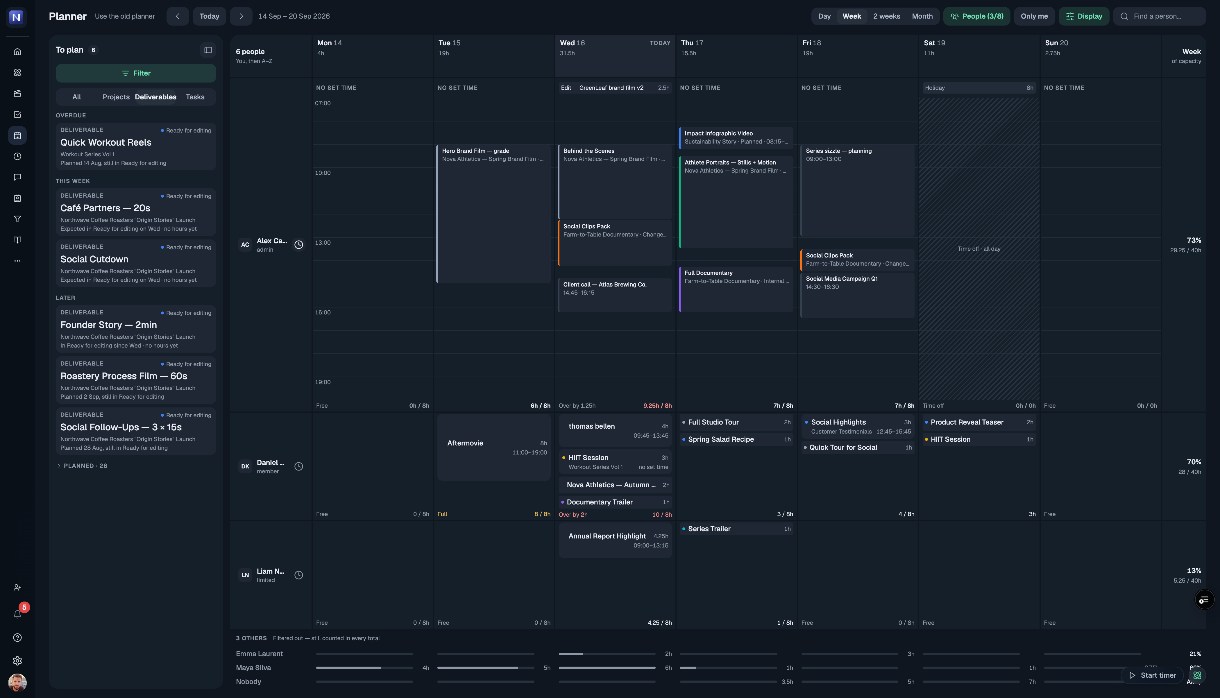
Planning now opens on the rebuilt planner. Same data, same blocks — but built for the part that was hardest before: seeing a whole team's week at once, and planning complex work across it.

That is the real change. Most calendar tools are built for one person's day and start to fall apart the moment you put a team in them — everyone gets squeezed into rows until nothing is readable, and the one thing you opened it for, who is free and who is drowning, is the thing you cannot see. For a production company that is the whole job. So the new planner is designed for it from the start: every person's week legible at a glance, capacity visible while you plan rather than after, and the detail still there when you go looking for it.

Open anyone's week without leaving the team view

Every person is one row. Click the clock beside their name and that row unfolds into their actual week — real hours, real blocks — while the rest of the team stays exactly where it was. Click it again and it folds back.

Plan several things at once

Pick as many deliverables as you need from the To plan list and drop them onto a day together. They all land, each as its own block, on the person you dropped them on.

Two ways to read a day

Some people think in people, some think in hours. The Day view does both: people across the top with the hours running sideways, or the clock down the side with people as columns. One toggle, same day.

Also new

  • A clearer grid that stays readable with bigger teams on it

  • Filter the To plan list by status, client and company, so you can ask "what is still unplanned for this client?" and get an answer

  • Drag a block to move it, pull its edge to change the hours

  • Capacity on every row and every day, so an overbooked week says so before you find out the hard way

Prefer the old one for now?

Use the old planner sits next to the page title and switches you straight back. The old planner retires on 23 September.

Tell us what you think

This is a big change and we would genuinely like to hear how it lands — what works, what is missing, what you would do differently. Message us on Google Chat, we are one message away. If you do switch back to the old planner, the box on that switch is the fastest way to tell us why. Both go straight to the people building it, and it is what decides what we fix first.

Improved

Earlier updates